2012 Assist Infographics: Point Gods, Guards, and Quetzalcoatls
Posted on Thu 16 February 2012 in The Stats They Carried by Aaron McGuire
So, earlier today, the fantastic folks at Basketball Reference released to the public a marvelous database. It includes a highly interfaced and searchable play-by-play database for the past 10 years. This is, quite frankly, incredible. There's virtually nothing your heart desires that you can't search for -- player performance by the time left in the game, detailed stats of what happens when players make certain plays, team performance in certain situations... I don't think I'm being overly sycophantic when I say that this is among the greatest single advances in easily interfaced, searchable, and public statistical databases in the world of NBA statistics. There may never be any one or two people who mine the database for all the insight you can get from it. Ever. Long story short, it provides an easy way to answer certain questions, and the ability to learn how to raise better ones. To that end, I'll be doing a series of posts where I graphically demonstrate certain things that this database allows one to easily find. I hope that these will be useful to you. They're certainly interesting, if nothing else. Today's introductory topic as I sift through the data for interesting insights: how are assists distributed among the league's best setup men? Who are their most prolific partners? When in the game do they get them -- and what's the score when it happens?
Interesting questions. And it's easier to scratch at answers than ever. Let's dive in.
• • •
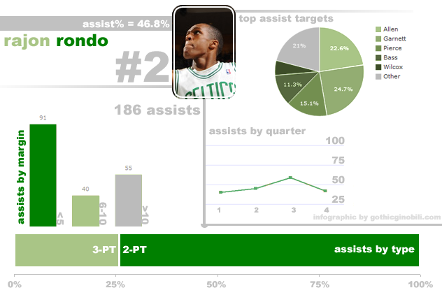
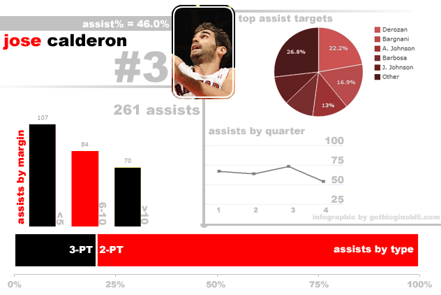
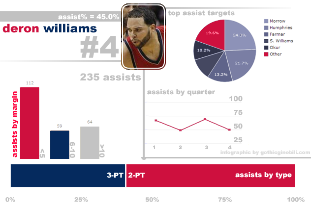
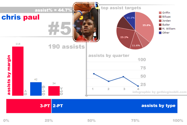
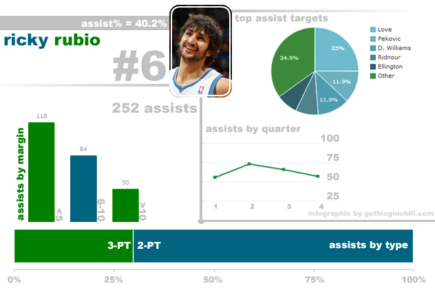
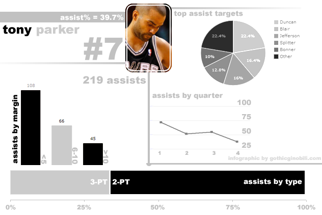
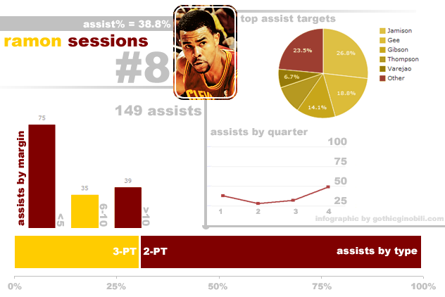
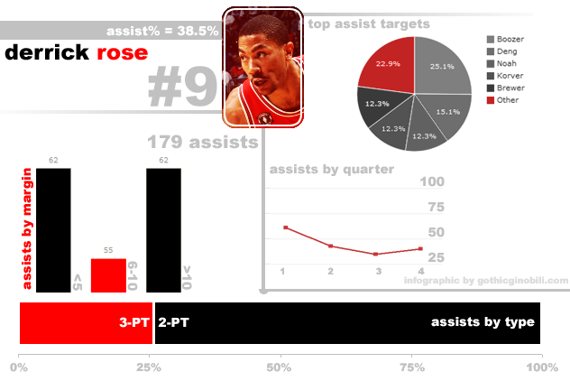
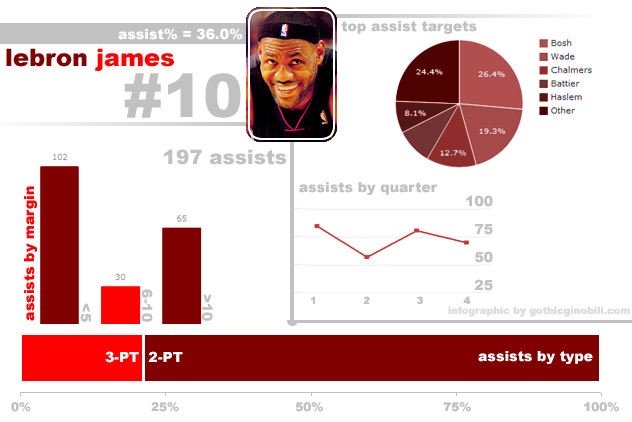
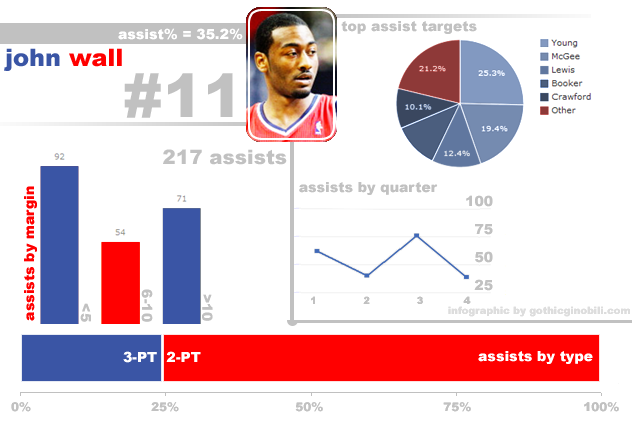
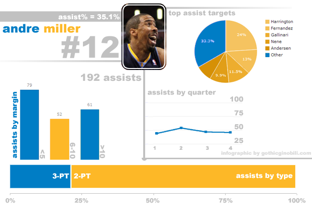
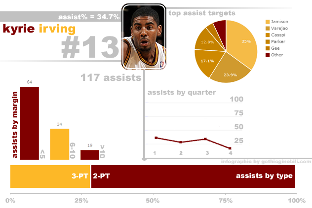
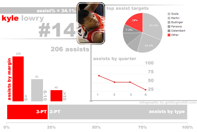
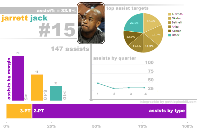
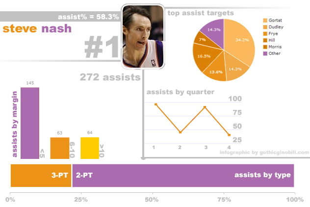
For this post, I'm producing graphs for the top 15 players in the league in AST% as of all games played on the 14th of February, 2012. Valentine's day! Because we love assists, here at the Gothic. For the data, you can go to our spreadsheet (or just search Basketball Reference yourself, obviously). I'm going to abstain from commentary in the post proper, because these graphs took a while to make and I think they speak for themselves quite well. I will commentate in the comments, if anyone wants to start a discussion. A few definitions, in case it's not immediately obvious. The charts are ordered 1 to 15 by assist percentage (or, the percentage of shots they assist when on the floor). Assists by margin refers to the margin of the game when the assist was made -- in theory, the "ideal" point guard would have more assists in a close game than in a game broken open. The assist target pie chart refers to, as one might expect, the players who completed the most baskets that the point guard (or the only non-point on this list, LeBron James) assisted on.
An interesting aspect (and one that I highlighted by using the team's secondary color to emphasize) of point guard play is what percentage of assists came from players outside their top 5 targets -- or, how many of their assists came from (usually) players they share less time with. Ricky Rubio is the best guard at taking advantage of the "others", with more assists coming to players outside his top five than any of those five individually. On the other end of the spectrum, Kyrie Irving has only registered eight assists outside his "main" five targets -- partly a reflection of the dismal quality of those others at finishing plays, perhaps partly an indicator that Kyrie's chemistry with the outer fringes of the Cavaliers pales to that of Ramon Sessions. The why is not our object, here, only the what. Assists by quarter is relatively self explanatory, and at the bottom of each infographic, you can see a demonstration through bars of how many of that guard's assists came on three point shots as opposed to two pointers (one area where Deron rules all comers).
All that said, here are the rest of the graphs. Enjoy.
• • •
Hope you enjoyed this trip through the seedy world of "hand-making infographics in Photoshop". For my next trick, I'll pass out in bed! Adieu, readers.
