Hey, folks! This year, I'm covering the Sloan Sports Conference straight from Boston's Convention and Exhibition Center. If you're there, be on the lookout for the tall guy in a suit who hasn't slept in a decade. Over the duration of the conference, I'm going to try to post some quick reflections on the panels I attended. Fun stuff, right? Here are the panels covered in the post, thus far:
-
9:00-10:00 -- "REVENGE OF THE NERDS!" On this particular panel (featuring a loaded roster of Morey, Cuban, Silver, Lewis, and Marathe), the big theme was the rise of statistics in sports and the challenges the high-rolling panelists faced during their rise. I discuss the overall oeuvre of the panel and the one place I wish they'd gone.
-
10:20-11:20 -- "DATA VISUALIZATION" This panel involved -- surprise! -- a discussion on data visualization. Moderated by Rockets' Sam Hinkie and starring a variety of visualization experts, the panel took a broad view of philosophies behind their data visualization strategies through minutiae and examples. Strange format, but a fun panel to follow.
-
11:40-2:50 -- "THE DIRGE OF THE SHAMROCK SHAKES" ... OK, no, this wasn't really a panel. It had panels in it, but that's beside the point. Due to the nature of the panels that were located in this timeframe, I won't actually be covering them in this post, but if you all are really good this year, Santa will tell you the story sometime later because it was a hell of a lot of fun.
-
3:30-4:00 -- "THE DWIGHT EFFECT" This was a paper presentation with Kirk Goldsberry, discussing new ways to assess interior defense in the NBA. It was a great presentation. I've shared some of the biggest findings and the best practices Goldsberry used to strengthen his case in this recap.
-
4:00-4:30 -- "THE VALUE OF FLEXIBILITY IN BASEBALL ROSTERS" Although this is a basketball blog, this was actually a REALLY neat paper with a tantalizing core idea. Here, I describe the rough summary of what their work implied as well as the NBA-related continuation of the idea I'd love to see in the near future.
-
5:00-6:00 -- "XY PANEL: THE REVOLUTION IN VISUAL TRACKING ANALYTICS" Kirk Goldsberry joined a who's who of visual analytics gurus to discuss the technology in a broad sense and some of the challenges and triumphs it's faced thus far. This ended up being one of my favorite panels of the day -- in my reflections, I describe the limitations of communication and the fun discussion on why teams don't use these analytics.
• • •
9:00-10:00 -- REVENGE OF THE____ NERDS
A panel with Daryl Morey, Mark Cuban, Nate Silver, Michael Lewis, and Paraag Marathe discussing their sports upbringing and various values and tradeoffs they've faced in their rise and their jobs.
"How did you get here?"
There was a short sigh from Cuban and a knowing nod from Morey. His one sentence answer? "It's not easy."
A wave of laughter spread through the ballroom. Amusing as it was, it wasn't really a joke -- getting there wasn't easy for the men on the stage. Sports is a strange world for a statistician, in a few ways. It's not that it's not a good laboratory -- it's actually PHENOMENAL one, with unbiased criterion for success and rich multivariate datasets. It’s a wonderful world to explore. Sports is an excellent place to learn statistics, and with the sole exception of Mark Cuban, everybody up there cut their teeth on applied statistics at a young age through baseball's fruitful data. In a perfect vacuum, sports is the perfect field for statistical analysis -- it's simply a beautiful place to analyze.
But that's all in a vacuum -- it ignores the very discipline-centric problems that analytics aficionados face in the sporting frame. Silver, Morey, and Cuban emphasized many of them, in different ways for each. The biggest issue? It's SPORTS! It's a world of loud testosterone-rippled men who don't love changes to the status quo. When analytics began to rise to prominence, there was a large pushback from coaches and the traditional analysts. There's a knife-edge balancing act between the long-term and the short-term. There are intractably huge datasets and false-leads that can lead a franchise astray. There's the randomness, the injuries, the coaching. The exogenous pressures from the traditional analysts has begun to wane over the years, and when asked how much of a challenge he experiences today when trying new analytic techniques, Cuban's answer summarized the sea-change in perspectives: "none whatsoever. Advances are always welcome." Things are different, hence the name. Revenge of the Nerds implies that the so-called nerds have won.
All things considered, it was a fun panel – I highly recommend watching it online yourself, as you can do here later today. But I felt that in their effort to simply describe how things happened and how things are, the presenters missed the most interesting angle -– that is, the why behind the analytical sea-change. Why have perspectives shifted? Why have sports analytics become so ubiquitous? Statistical analysis doesn't only involve success stories, even if we'd like to think it does; some teams fail miserably at it, and the first thing any statistician would tell you is that a lot of statistical analysis can be useless and ineffective. The reason things have shifted isn't just some rah-rah success story about a perfect way of thought, it's a story of statistically minded analysts learning to communicate. It's a story about how Nate Silver's writing made statistical thought engaging. It's a story about how Daryl Morey learned to navigate the give-and-take with his coaching staff and his players. It's a story about how deeply Mark Cuban understands the business structures at the core of a sports team. That's the story I was hoping to hear, and while the panel was fun regardless, I felt they missed the boat a bit by covering the what instead of the why.
• • •
10:20-11:20 DATA VISUALIZATION
A panel with Sam Hinkie, Joe Ward, Ben Fry, and Martin Wattenberg discussing the visualization of data in sports analytics. Broad theme, right? Well...
There was a lot of audible grumblings in the audience during much of this panel -- most of us skipped out on the Stan Van Gundy panel for this one. Hopes were high that we'd get a lot of new and interesting data visualization methods. Final verdict? Not so much on the "new and interesting" front. As it turned out, the panel turned into something akin to a nerdy fever-dream spinoff of American Idol -- they placed a bunch of (primarily) public-use data visualization tools on a large screen and picked them apart.
There were a few panelists who were generally focused on descriptive problems, and issues of presentation. Who was the visualization meant for? How did it do its job? What were the positives, drawbacks, et cetera? Some of them liked most of the visualizations, most of them had a few comments for improvement, some of them They even had their own Simon Cowell in Joe Ward, the graphics editor for the New York Times. Ward was a tireless critic, giving drawbacks and missed opportunities for almost every single visualization put on the screen. One that I found particularly funny -- a relatively old Kirk Goldsberry shot visualization came on-screen, and Ward almost immediately pointed out a small problem endemic to most of Goldsberry's oldest work -- the drop shadow on each basket area actually muddles the coloring in many locations, which can badly obfuscates the point of the chart.
Overall, a bit of a weird result for the attendees. A panel with a theme as broad as "Data Visualization" ended up being (essentially) a treatise on the minutiae that made up their personal philosophies on data visualization. Take out that drop shadow! Realize your minimalist dreams! Consider your audience! Et cetera, et cetera. While enjoyable, it was somewhat of a surprise for most of the audience, which led to all the grumblings -- especially when Van Gundy was talking about Dwight Howard just a few rooms over. I'm glad I went, if only for professional reasons -- a lot of the work I do in my Clark Kent job involves tireless data visualization, and although most of the things discussed were things I've thought of before, it was actually quite helpful to hear that kind of critique and analysis on a broader scale. It was a pretty strange format for a data visualization panel, and I expect I could gotten a bit more out of the Van Gundy panel. But I don't think many attendees who stayed til the end were disappointed in the overall result. Unless you aren't a ridiculous visualization nerd. If that's the case, this probably was excruciating for you.
... That said, why would you be here if you weren't a ridiculous nerd? The world may never know.
• • •
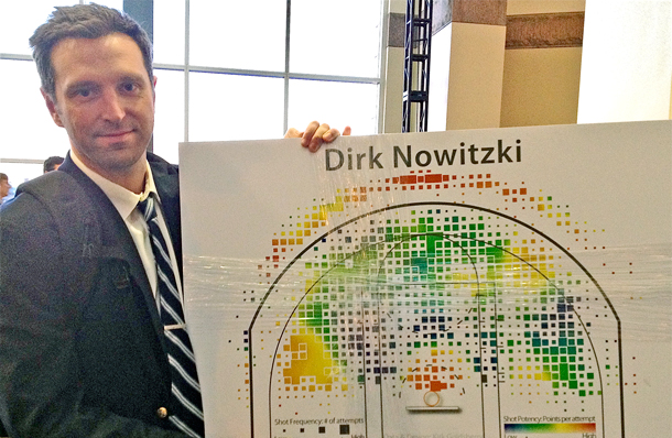
3:30-4:40 -- THE DWIGHT EFFECT WITH KIRK GOLDSBERRY
The Dwight Effect is a research paper presented by visual analytics guru Kirk Goldsberry, whose work you may be familiar with from Grantland.com and Court Vision. He discussed new metrics to measure interior defensive efficiency and shared some of his most interesting findings.
This one was different than the above two, as well as the panel on randomness that I'm waiting a bit to write about because I want to mull over some of their statements a tad more. This was simply Kirk Goldsberry (the visualization guru behind the much-lauded Court Vision location analytics) presenting a few explications of new defensive analytics. He'd brought a few of them out before, but never quite this starkly. I think it's safe to say that this was one of the best individual presentations you can put together at a statistical conference -- in classic Goldsberry fashion, his presentation was light on the tables and heavy on the visuals, with the highlight being a 2 minute blooper reel of David Lee's defensive mishaps in last week's Golden State/Minnesota game. The panel focused specifically on a few of the most notable findings from Goldsberry's work. It started with "LARRY SANDERS!", the statistically-minded blogosphere's new mancrush.
Sanders has developed into one of the best defenders in the NBA, completely shutting down the restricted when he gets within an arm's reach of another player. Given that he has such long arms that "arm's reach" is akin to Tyler Zeller's "thirty miles away" (TBJ joke!), that helps him destroy players in the post and when they try to shoot anything close when he's on the court. Conversely, while Anderson Varejao is an excellent rebounder and a player who does a good job getting into defensive position, Goldsberry's metrics showed that he was surprisingly permissive when a player actually got a shot off against him. He got to a lot of shots, though, and that turned out to be an important key -- Goldsberry's metric was only half of the story, as it measured what opponents shoot when the player actually gets to his spot and makes an attempt to guard it. What wasn't covered in depth during his presentation (but WAS a part of his paper as a whole) was the flip side of that defensive equation, essentially summarizing how often the player actually gets to his spot.
They were two extremely intuitive splits to measure defensive efficacy, with Andrea Bargnani being presented as the number one example. As I mentioned in the Player Capsule for Bargnani, his problem isn't that he allows a crazy percentage when he actually defends the shot -- he's a reasonably effective defender, overall, and Goldsberry had him in the top 5 of his "FG% against" in the restricted area. His problem is simply that he never gets to the shots! He lays back and misses rotations and posts very few challenges, in effect creating a defensive vacuum that's easy to observe when you watch him play. He may defend the shots he defends reasonably well, but if he's refusing to defend, who really cares?
One last thing I liked a lot: Goldsberry gave an excellent drop-down of some of his limitations. All too often in conferences like this do you see presenters and panelists become too wrapped up in their own work and refuse to acknowledge their biggest limitations. Goldsberry pointed out that he ran into major time/space constraints due to the heavily visual nature of his work, he had limited timespans of data to work with, and -- after being aptly pointed out by Andres Alvarez from Wages of Wins -- the fact that Goldsberry's defensive metrics remain untuned to the impacts of fouls and free throws drawn. All that gave the presentation a nice aura of a work in progress, and a general air of a presenter who didn't think he was the greatest thing since sliced bread. As someone who's seen far too many presenters take (essentially) that exact tactic, it was much appreciated for me.
• • •
4:00-4:40THE VALUE OF FLEXIBILITY IN BASEBALL ROSTER CONSTRUCTIONS
This paper analyzed the value of positional flexibility in baseball.
I won't spend too long on this one, for obvious reasons -- namely that this is a basketball blog rather than a baseball blog. But I have to mention the overall theme and the response beating so vividly through my head after the presentation concluded. The main idea was that a researcher could create a two-stage model to assess the true value of flexibility for baseball players. It essentially involved a first stage where you measure the probability of injury for each player and a second stage where you measure a player's potential efficacy when that player's role changed on the field. For instance, if your center fielder was struck by lightning, who was the best replacement on the team? There's a really interesting subtext to these questions and this mode of analysis -- you're essentially trying to come up with a way to predict how a player will function in a role they've theoretically never played before, and assess the value of a player when they've been sequestered to the role. It's interesting stuff.
My first thought, though? Isn't this possible in basketball? Don't get me wrong -- we could try to use the cardinal five positions, but I don't think that's quite the best way to approach it. I was thinking about the question with certain skillsets instead of positions. Take, for instance, Tim Duncan. You can argue all day whether he's a center or a power forward, but NOBODY who's ever watched the Spurs needs to argue about his rebounding. When Duncan is on the court, he's San Antonio's primary rebounder. Period. When Steve Nash is on the floor, he's the primary ballhandler. When Kyrie Irving is on the floor, he's the primary shot-consumer. Et cetera, et cetera. Instead of measuring how basketball players fit into a somewhat outdated positional archetype, I think a neat way to approach the question would be to pose -- statistically -- the idea of giving each player a score of how well their underlying metrics imply that they'd function (relative to the league average and baking in adjustments for role) if they had to switch roles.
What if we lived in some horrible Don Nelson alternate universe where Tony Parker was asked by Popovich to be San Antonio's primary rebounder? What if we examined what a team would be like if they asked Darko Milicic to be their primary ballhandler? Et cetera, et cetera. It opens up a lot of interesting questions, and if you make the overall point of the statistic a cardinality ranking, you could potentially uncover certain lineups and player-roles that coaches rarely use that could be more advantageous than the fan or the coach might initially assume. It's an interesting question, in any event -- it'll be interesting to see (if I happen to get the time, or if one of our readers takes this idea and runs with it) what this kind of analysis uncovers.
• • •
5:00-6:00 -- XY PANEL: THE REVOLUTION IN VISUAL TRACKING ANALYTICS
For the last panel of the day, Kirk Goldsberry joined a who's who of visual tracking analytic experts and discussed
No typo: Tony Parker's max speed in an NBA game last year was 20.9 MPH.
That sort of mind-blowing stat is the sort of thing we'd see more of if we had public access to the sort of visual player-tracking data that SportVU measures on a day-to-day basis. They're cooking some ridiculous numbers back there. What's the goal of data like that? Put simply, it's a matter of learning how space affects the game. In a vacuum, the idea that Tony Parker can go 20.9 MPH with the basketball in an NBA game has no value -- in context, it can be more important than any individual line on the box score. It's a representation of the marginal tidbits of skill that makes Tony Parker such a brilliant basketball player. It represents Parker's ability to change the entire shape of the defense, and in a broader sense, measuring in-game speed like that allows more granular analysis of draft combine data and other such physical attributes.
After shocking the audience -- or at least Tim Varner and I -- with a jaw-dropping opening stat like that, the panel changed course into the more interesting question: if the stats of location analytics are so game changing, why do only 15 out of the 30 NBA teams buy them? The panelists provided a lot of great answers, and they touched on what I feel is the main problem: the confusing interpretability of multivariate coordinate data. What do you actually DO with that data, especially without the right personnel? Kirk Goldsberry put it best when he noted that the data -- while burgeoning with potential and beautiful to analyze from a purely academic perspective -- is borderline gibberish when you aren't putting it through the proper treatment and proper rigor. Not every team has the sort of academics you'd need in order to apply that sort of treatment. If you don't have those people, you aren't really going to get much out of data like this -- you may get a few facts and figures that make scouting a bit easier, but you'll barely scratch the surface at best and waste a whole lot of money at worst. You need a certain set of people to really sift through this sort of data. Simply acquiring the data doesn't tell you enough about how the team is using it, or even how CAPABLE they are of using it.
That whole problem points to a deeper problem with the general sports analytics community that Kirk Goldsberry -- more than almost anyone -- understands and dares to approach. It's similar to the inherent issue I talked about in the blurb above during "Revenge of the Nerds." Even if analytic thinking was a golden bullet that solved every single basketball problem on the planet, you can't simply try to impress people with great information -- you have to be good at sharing it. There's a big lumbering abstraction that many like to lean that statistical-leaning basketball analysts like to lean on; it's this idea of the grizzled old Clint Eastwood-esque coach is just constantly belittling and whining at the poor wide-eyed stat-guys trying to bring them the good work. It's a tale where those who refuse statistical analysis are ignorant, incompetent, and intransigent to change. That's a fun little story to repeat ad infinitum, but it's also completely wrong. The fault isn't on the coach in this situation, necessarily -- the fault lies just as strongly on the statistical analyst who refused to communicate effectively with his audience! Communication isn't simply a war of attrition, it's an earnest effort to find the right ways to present and fashion your work in a way that your audience can actually approach it. It's one thing to impress a bunch of people with a logorrhea of numbers and figures. It's quite another to actually make a presentation your audience can actually use.
One way to do that -- as Goldsberry knows full well -- is visuals. Another way is to hire the right people to analyze it. And yet another is to -- as many teams have -- ignore the data entirely and wait until a team figures it out and the information leaks. It's the classic "Lobochevsky-Lehrer strategy", where an organization can remain willfully resistant to pouring money into innovation with the goal of piggybacking off the first successful model once the details leak. (Lobochekvsy-Lehrer strategy is a rarely-used metaphor, so I'll explain in short -- I'm a big Tom Lehrer fan, and Lehrer has a song about the great mathematician Nikolai Lobochevsky. The song outlines the merits of plagiarizing in the academic world. Lobochevksy himself wasn't ACTUALLY an esepcially notablle plagiarist, and the song isn't a slur on his character. It's simply an example of a far-more-common-than-you-think tactic that companies, academics, and organizations use when they don't want to invest in research. Simply put, they ignore the problem entirely and hope that when someone actually figures it out they'll be able to find a leaked version of the work and piggyback off of that. It's a bit annoying, but it's something that happens extremely often. It's actually more surprising to me when everyone tries to innovate than it is when half the organizations try to piggyback. It's tried and true. It works, you know?)
Anyway. All-in-all, it was an excellent panel. As with Revenge of the Nerds, when MIT puts the video online, I highly recommend taking it in.
• • •
Day #2 coverage comes on Saturday. GET EXCITED!
Continue reading